Back
Keep walking to the right
Asian influence (2018-present)
The Asian influence began when I got into K-pop and I wanted to explore more of the Asian culture and their tradition. This era was an important period for me as it helped me get out of a dark period of my life and it was one of the few ways, I could escape reality while I was creating the art pieces that I enjoyed making during High School. Also, for the last 2 years of my high school journey, I chose a theme that my next 8 art pieces would be about, I chose South Korea as my theme. I wanted to portray something that people often missed within the culture, such as patterns and mythologies of the country and other natural aspects.
Rectangular Coffee Table with Drawer Lift-Top Hidden Storage Accent Table, HOMARY
During my middle school years, in design, we would brainstorm with pictures and get inspiration and ideas from it. One of those images that I still remember is this table. I liked how within the table there were multiple storage compartments. I also got fascinated by how the space was used and how the designer designed it in a way that would save up space and make it conventional.
Saint Adelaide Patron Saint of Sex Workers and Freer of Those in Psychological Bondage
Cristina Tufiño (2018)
Ceramic, underglaze
35.6 x 22.9 cm
Her artwork showed me to not care how something looks and to trust what you want to do. All of her designs are quite interesting to me as they are "odd". This piece shows the finer details of the exhibition, as this focuses more on the appearance of the product or art. The style and material that Tufiño used for her designs are intriguing to me because they almost look texture-less and very smooth when they are made from clay. The color choice that she uses is monochrome and bold.
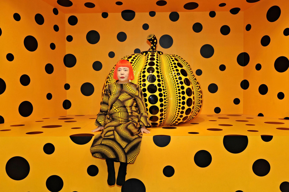
Kusama with the pumpkin
Yayoi Kusama (2010)
Fiberglass, reinforced plastic, and urethane paint
112.8 x 117.6cm (installation size may change)
During my inspiration research, I came across her work and it really intrigued me. I researched the meaning of her pieces and her life to see if there was any correlation between them. Yayoi Kusama is one of the most influential and inspiring people I’ve got to know. I found it fascinating how she expressed herself and her traumatic childhood in very vibrant and colorful installations. However, when you realize these are the hallucinations she has had since she was a kid, your view on the installation changes. I admire her for the work she has done and how she does it, as I've also found art and design as a coping mechanism to deal with my own problems and challenges that I've faced.
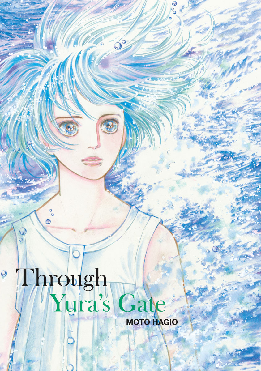
Through Yura's Gate, Moto Hagio (2017)
Going back to the Asian influence, I often find myself ticking a lot with manga and anime as each one of them is different whether it’s the plot or the style in which it has been drawn, which reminds me to keep trying different styles and that everyone’s work looks different, so we should not compare our work with others. I usually compare my work to others, which causes me to be too hard on myself because I sometimes think my work is not good enough. By watching the art put into anime and manga reminds me that my work does not need to look as good as other people's work.
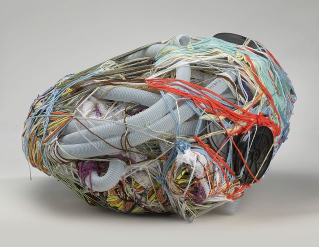
Untitled
Judith Scott (2004)
71 x 38.1 x 68.6 cm
Fibre and found objects
Judith Scott came into my designs later on, but still influenced and inspired me to keep pushing forward and to not allow my disability to discourage me and to try to work around them. I got diagnosed at the age of 7 with ADHD and throughout most of my life, I’ve always had some sort of support (medication) or adaptation (teacher support) made but going into High School that was taken away. The course was very hard on all the students, which made me sometimes discouraged because I felt stuck and I saw that my classmates were making much more progress than I was. During class I would struggle to keep myself focused on the content and made me fall behind, these times were hard on me, especially mentally. Judith’s life and work showed me that even with a disability, she has down syndrome and is deaf, I should still push forward even if my art is not what many people like, it is ok to make things that please you as an artist.
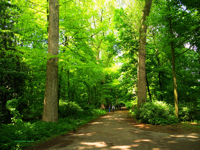
Kralingen forest (Nature)
Due to the pandemic, most of us have been forced indoors, which put a halt to hiking or just a walk in the nearest park. During this time, I really realized how important is nature to me and how much it influences my mood and my mental health. I’ve always loved nature and being far away from it changed the way I thought, my head was full of never-ending thunderstorms. Since then, I’ve wanted to show the nature around us that we might often not value. also, being an active person throughout my whole life and I've always wanted to play outside rather than staying indoors. The past year has taught me to appreciate it more because we don't know when we will be quarantined next or how nature will last with the current climate situation.
The uncomfortable
Katerina Kamprani
The last piece shows my all-time opinion on design, it must be useful and conventional. I’ve thought of design as a way to improve lives, to bring a place back alive after it has lost its beauty. This chair sets a perfect example of what I believe is useless and unconventional. This piece came across as I was doing my research for a course project in which I had to create a stool. When I do research, I create a brainstorm of designs to get started on the project and to look back and get inspired if I ever get stuck while designing a product.
Untitled, 2015.
During middle school, I had design class and we would create one product within a topic, we would choose our target market and we would have to interview our target market. This sketch was one of the projects that got me into wanting to pursue product design. I liked the feeling and the aspect of creating a product that could benefit those around me and that people would like.
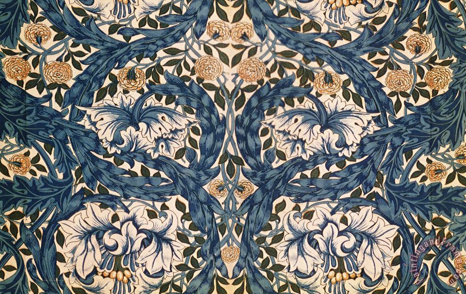
African Marigold design
William Morris (1876)
Printed silk
Moving forward, is Morris’s, African Marigold. I came across Morri's work when doing my Comparative study for my diploma. His work is fascinating to me, especially from the technical point of view. I admire the traditional printing techniques that he used to create his unique designs, as the industrial techniques were all identical which made them seem passionless. I also really valued that he created patterns from natural elements that surrounded him and that other people might not value the beauty of it, which he did by capturing the nature into an endless print.
The exhibition consists of artworks that have shaped me into the designer I am today. Some pieces were inspirational, while others were the start of my designer life, as they intrigued me and made me want to produce products for other people to enjoy. The pieces develop further from the latest and bigger influences to the present and finer influences. The first few pieces focus on the aspect of my personal growth as an individual while towards the last artworks focus on aspects of my life as a designer and how and what message or story I want to portray to the public through my designs. The structure in which I wanted to display the artworks was inspired by the typical setup you would encounter at a gallery or museum.
The white background makes the exhibition seem cleaner and it focuses the attention on the actual focus point of the exhibition, in this case, it being the chosen artwork and photographs. The light background also brings life and light to the room as some of the subjects discussed in the artwork text are quite dark. Another reason to which I chose a white background, was to make it seem like the wall was never-ending which then allowed the audience to see the progress of the art pieces. In contrast with the white background, I framed the artworks with a black outline wanting to create a beginning and ending to where the pieces started and to give them their own space as if they were actually being displayed in a reputable museum. Following the black and white theme, I did the text in a light grey to go with the color scheme. The text was written in a black font over a light grey background to distinguish it from the white background but also allowing the writing to be read comfortably. The font chosen is a simple and easy to understand that was also a bit formal so that it made the website a bit more of a professional appearance. On the top left of the website, there is a signal indicating in which way the viewer should move. I wanted to make it a bit interactive, as in the online exhibition is quite hard to discuss the pieces with other people and have some interaction within the “room” due to the current social situation.
The work in the exhibition is all linked to me, as an individual person and as a beginner designer. The story of the gallery is how I came to be who I am today and to read this message it is necessary for the text to be read as it explains the story behind each picture and how it affected me or my designing ideas. Some pieces affected me deeper than others which were normal events that affected my mental health and some aspects of recent changes in my daily life. For this exhibition, I planned to make it very close to me as a designer but also how my personality and life events have affected my way of expression through design, which is a side of me that I often do not discuss with people but is very dear to me, which I think I’ve achieved with the collection of these 10 pieces and the artwork text.
The categorization of the exhibition is quite simple yet complicated in some ways. I categorized the photographs in chronological order, but also in some cases I came across the artworks or artist in a similar time of my life so I categorized those from the most important and close to my heart to those who are more superficial and that I do not value as much compared to the others. To define this change of period I classified the artworks in rooms so that it can be told that they are from the same period of time and also show the relevancy of the pieces in my life.
The designer I am
The beginning
High school
The present continues